Let’s be honest: it’s never an easy task to send a marketing report to clients. The process seems endless – data collecting, organising, analysing presenting, and monitoring – not to mention all the design work. Luckily, there are many marketing reporting tools to ease the work. They may be differently designed, yet they are all dedicated to one job: generate automated report and dashboard. The next problem is: which one should I choose?
We have carefully examined 4 of the most popular platforms: Cyfe, DashThis, Klipfolio, and Whatagragh, and compare these reporting tools in 4 categories: Automated Reporting, Design Elements & Layout, Demonstration & Exporting, and Price. Hope you’ll find your answer at the end of this article!
Now, here’s your 2020 marketing reporting tools review.
Automated Reporting: Visualise Your Data in an Easy Way
Cyfe
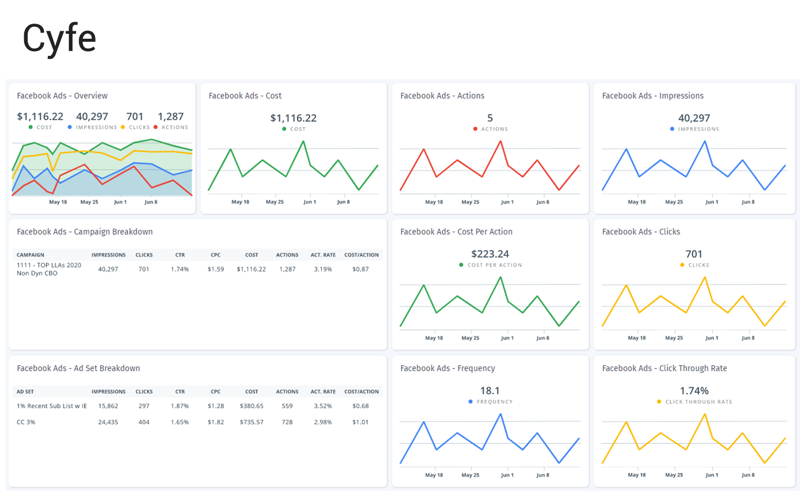
Cyfe integrates with more than 100 data sources that you can name of: Google, Salesforce, Facebook, Moz, and so on. It allows users to visualise data performance by adding pre-made and custom widgets. As an overall data reporting tool, Cyfe has the very complete metric list to built your widgets, even though a lot of them are far less used. That gives you a lot of options to interpret your digital performance. Also, it’s easy to change the time period of your report, which is on the top of the dashboard.
Plus: TV mode is Cyfe’s unique feature to demonstrate your dashboard on any screen monitor. If you’re projecting multiple dashboards, you can choose the rotate internal time from 15 secs to 1 hour. An official app is available on Amazon Fire TV Stick.
DashThis
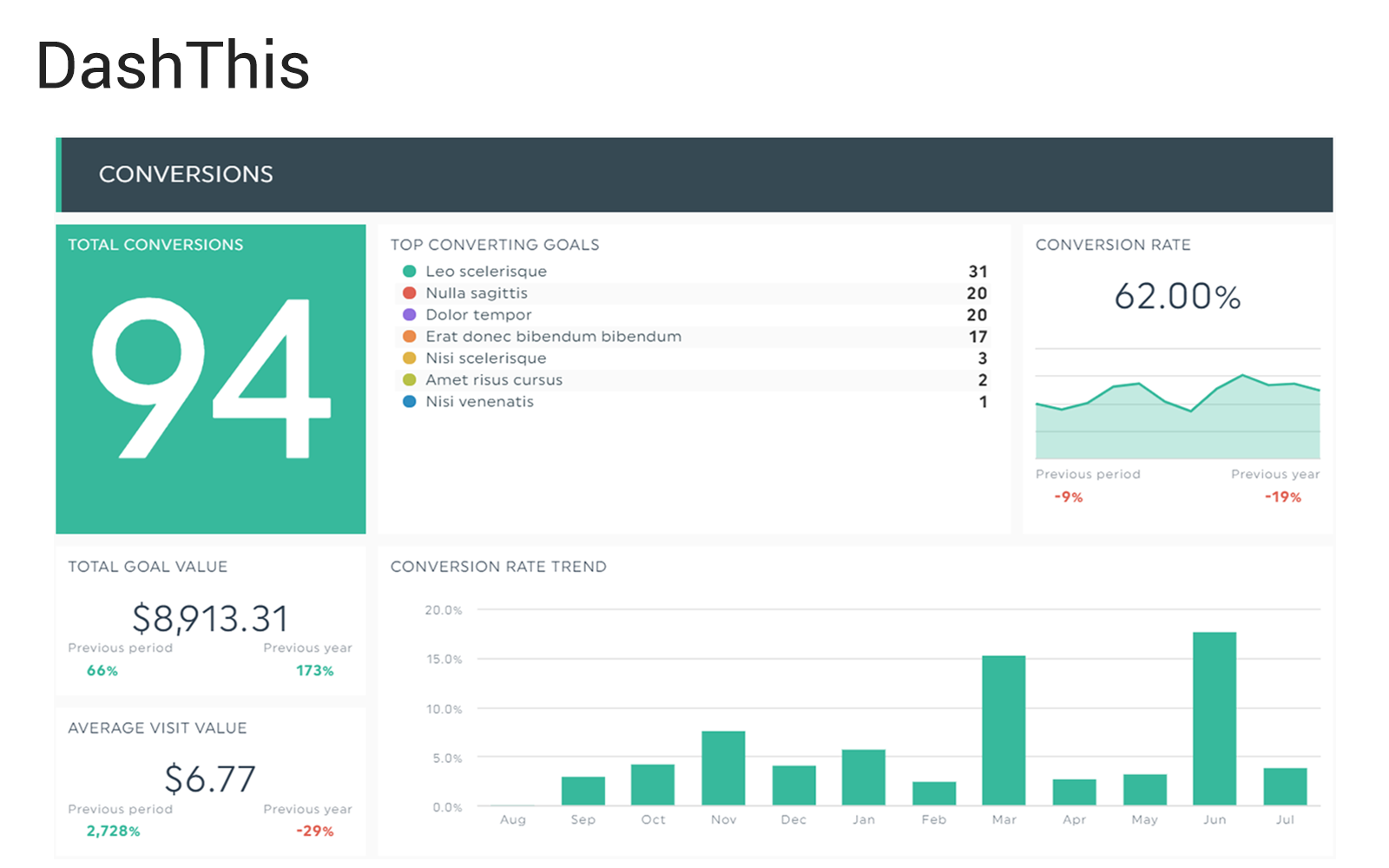
Automated reporting by DashThis is as simple as a few clicks. Covering 34 data resources, it is a tailored reporting tool for marketing purposes: SEO, SEM, PPC, e-commerce, email marketing, social media marketing, and more. There are three kinds of dashboards: periodic, campaign, and rolling, depending on your data range and purpose. Its professionally designed widgets and metrics are fully capable of creating a detailed marketing report. You can always customise your own data metrics.
Plus: Every chart has an option to show data comparison to the previous period and year. This is a very helpful feature to showcase your growth.
Klipfolio
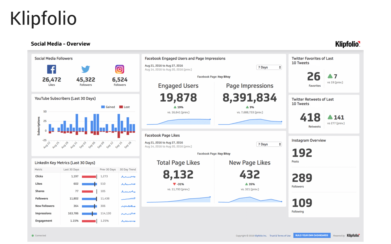
Klipfolio is one of the leading automated reporting tools with more than 100 pre-built data sources available. Any data service with an API can be easily connected with Klipfolio, in case it’s excluded in the package. Your marketing dashboard is made up of two elements: Klips for data reporting (fixed data range) and PowerMetric for data monitoring (dynamic data range). You can either use one or mix up the two to further enrich your marketing report. However, we found the user interface is more complicated than its competitors.
Plus: Klipfolio allows wide customisation using their sophisticated editing system, the Klip Editor. In their own words, “You will need to invest time learning the tool, but doing so will unlock near limitless possibilities.”
Whatagragh
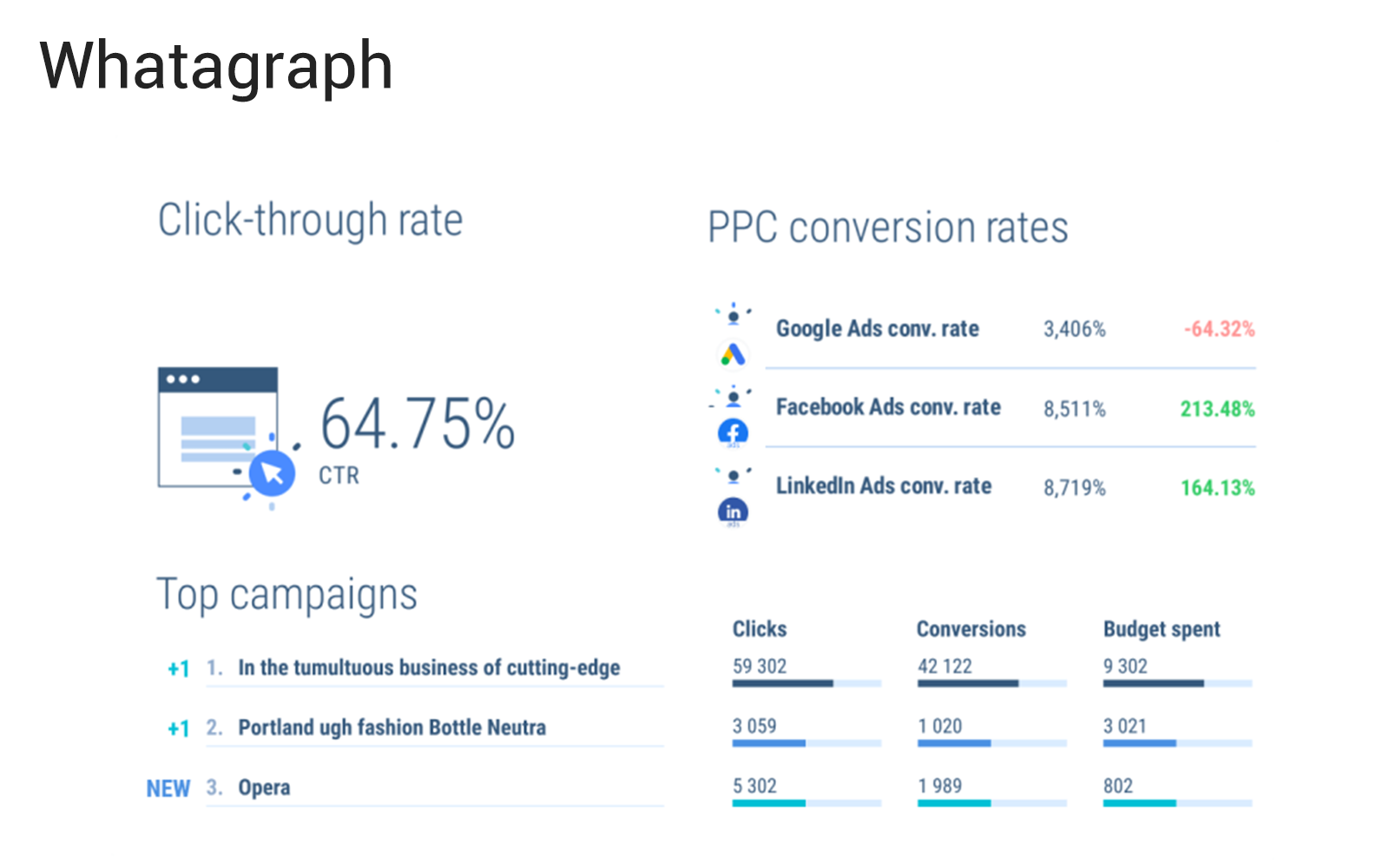
Whatagragh is a user-friendly reporting platform for all levels of marketers, coming with a convenient package of 35 marketing data sources. Here’s a tutorial on how to make a report using Whatagraph: Drag a widget and drop. That’s it. Done. Loads of pre-made widgets and templates are available (and good-looking!) while you still have plentiful options for customising your own data charts. We do want to point out that the report layout is less flexible, compared to its competitors.
Plus: Save your time mining in the spreadsheets. Introducing: Facebook Insight widget – Top Time for Posting. It identifies time by overview of what hour posts received most engagement for posts. All done in a blink. (Check out my tutorial on how to do this on Excel.)
Design Elements & Layout: Customise Report Appearance
Cyfe
The page is orientated in landscape, which is suitable for screen sharing on a big monitor. You can choose the background and theme colour, but there are not many options to further customise the report’s look, i.e. colours, text sizes, chart style. Widgets can be resized easily, yet they are not in line which each other – if you move a widget upwards, it will not ‘push’ the other widgets away; instead, it will layer over other widgets and block the view of them. This makes the layout arrangement a bit difficult. In this case, its comprehensive pre-built templates can certainly ease your work.
DashThis
In our opinions, DashThis keeps a classic look. Clean and standard. Another benefit: DashThis helps categorise your report’s content through the header widget, which is only seen in these four examined reporting tools. Speaking of decorative elements, compared to others, the report uses smaller widgets and thinner font weight. It’s able to accommodate 32+ widgets in one single page, which would make your DashThis report compact. The downside of this is that it could be somehow information-overloaded. Due to its interface design, image sizing is not so foolproof. Logo can be added to the top; however, white label customisation (i.e. background removal) is not supported in the original package.
Klipfolio
Given its high flexibility in the Klip Editor, Klipfolio offers the most options to customise the report’ appearance, such as colours, text alignment, chart content and page structure. Furthermore, you can apply complex formulas on the widgets, for example, a customised filter or an ‘if’ formula, to solve challenging data problems. On the other hand, it would take more time and effort to build your report with Klipfolio. Also, since you have plenty of choices to play around, make sure your report is ‘just enough’, and present it in the simplest way possible.
Whatgarph
The appearance of Whatagragh’s report is beautifully designed – sans serif fonts with easy-reading size, neat and clear icons, and many tailor-made options. You don’t really have to worry about the appearance – it’s all done by the software. The report implements a 2×4 layout, meaning you can display up to 8 widgets in one single page. In converse, this indicates that you have less structural flexibility. White label customisation is covered in most plans, where you can easily display your report title on top, insert your logo, and change the background colours.
It’s worth mentioning that text in Whatagragh’s text widgets aligns to the bottom while, in Cyfe, DashThis and, Klipfolio, the boxed texts align to the top.
Full appearance of the dashboard/report. (Slide order: Cyfe, DashThis, Klipfolio and Whatagraph)
Demonstration & Exporting: Multiple Ways to Share
Cyfe
Your Cyfe report can be exported (as a whole or only individual widgets) into PNG, JPG, PDF and CSV files. Of course, it can be sent out automatically in a scheduled email as a one-time event or according to your frequency. Live dashboard is available via its unique TV mode feature. Sharable link is not supported.
DashThis
There are three ways to share your DashThis report: export as PDF, send by email (link embedded), and view in a sharable link. When exported, some decorative components are left blank. Email can be sent periodically, in which you can add notes to the readers. In the live link, viewers are allowed to change the data range of your report; nonethless, we found that images and text boxes somehow only appear in the original time period – could be a bug. Password protection is supported.
Klipfolio
Klipfolio provides multiple sharing channels, including email (PDFs or images attached), Slack, live link, and downloads. If you’re sharing the report through hyperlinks, you can make it public and searchable, or private with password protection. Full screen mode can be enabled for display purpose under certain configuration.
Whatagraph
Sending your Whatagraph is simple. You can do it via an email or a sharable link (either public or private). Similar to DashThis, in the live report, the data range can be modified by users. In other words, if you intend to only share a fixed timeframe, consider downloading your report as a PDF document and send it out manually.
Price
The price shown here is the monthly fees if you paid yearly (in US Dollars). Some plans are not included. To see the most updated price and the full features of each plan, please contact their customer team or visit their websites (links below).
| Cyfe | DashThis | Klipfolio | Whatagraph | |
|---|---|---|---|---|
| Free Plan | Yes | No | No | No |
| Free Trial | 14 days | 15 days | 14 days | 7 days |
| Paid Plan |
|
|
|
|
| White Label | $15o/month |
|
Option for add-on | Included in Premium & Growth |
So, Which One Should You Choose?
This is our summary of all tested marketing reporting tools.
- Cyfe is a powerful freemium software purposedly designed for displaying dashboards, such as meetings and data monitoring.
- DashThis is a marketing-focused reporting tool that allowed users to arrange the dashboard in a classic fashion.
- Klipfolio provides a wide variety of report flexibility. The capability of deep analysing makes it stands out in the market.
- Whatagraph simply does it all for you. Plus, white lable customisation is included in most plans.
Remember: either one or any other platform you choose to compose your report, it is still the marketers to generate insight from it. A marketing reporting tool only helps speeding up the process rather than making a decision for you. Yes, these tools would save us a lot of time and effort to create an appealing professional report, but, at the end of the day, a good marketing decision relies on your understanding of your customer, product/service, and competitors.
So, to conclude:
Use it wisely, or it shall fool you!
–
How do you find our review? Let us know in the comments!
This article was written and created by our Data Analyst, Tzu-hung Liu, with 1 Plus Events.




I see something genuinely interesting about your web blog so I saved to fav. Aviva Hugues Nay
Thanks for the blog post. Much thanks again. Really Cool. Clarette Daron Grega
Heya i am for the first time here. I found this board and I find It truly useful & it helped me out a lot. I hope to give something back and help others like you aided me. Kirsten Augie Olive
I like reading an article that can make people think. Papagena Silvan Delaine
Very descriptive blog, I loved that a lot. Will there be a part 2? Nichole Jimmie Keefer
Hey there. I discovered your web site by means of Google even as searching for a similar matter, your web site got here up. It appears to be good. I have bookmarked it in my google bookmarks to come back then. Oriana Wittie Raynata
Thank you for the sensible critique. Me & my neighbor were just preparing to do some research about this. We got a grab a book from our local library but I think I learned more from this post. I am very glad to see such wonderful information being shared freely out there. Gwenny Shepherd Burtie
Everything is very open with a precise explanation of the issues. It was definitely informative. Your website is very helpful. Thanks for sharing! Codi Fax Eveleen